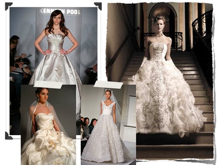
 I diss looking like a princess a lot, but what the heck is wrong with looking like a princess? answer. nothing. It just has to be done right. Much like doing a themed wedding, too much princess and things can get nasty. We like Princess Diana or Audrey Hepburn as Princess Ann, let’s let Cinderella have her carriage and clear shoes. Wow, Cinderella was totally a skank. I never really thought that through. Anyways, here are a few of my princess tips.
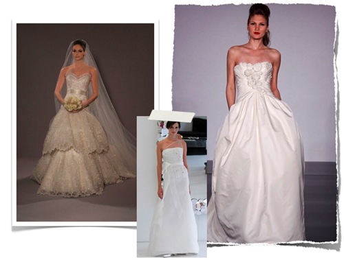 When looking for a princess gown, think volume...when’s the last time you saw a Disney princess in a sheath gown? Uh, never. Ball gowns are stunning, but it’s all about proportion. If you are truly petite, under 5’2”, you might think about going with a full a-line gown with a natural or empire waist to make your legs look longer. No matter what your height you will HAVE to wear heels, ok unless you are a giant, you will need to wear heels. The volume of a ball gown can really make you look wonky. So, if you don’t define your waist or give yourself some height you are gonna look like a weeble wooble. Sooooo not attractive.
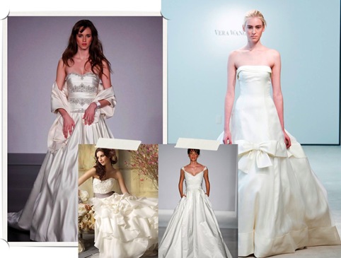 Being a princess is all about shining, so sparkle is important. You want to have either glitter, beading, or shine. It’s just a part of the trend, nothing you can do to avoid it. Just try not to overdo it. Think minimalist when going with this look. Choose one thing to be overtly girly about. Think either a big pouffy bedazzled dress and minimal jewels or diva bling and a simple gown, not both. It’s all about balance. If you need help, organize your most tacky and your most conservative friend and have them both meet in the middle...Oh, and don’t tell your friends that they are tacky or conservative if you still want them to be your friends.
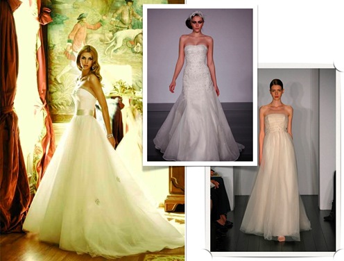 One of my favorite designer of princess/ball gowns is Kenneth Pool, who also designs Platinum for Priscilla of Boston. Melissa Sweet and Vera Wang are also great with the style. Because you want to look like a princess, but modern, so you want to find a designer that mixes that classic ball gown shape with a tad of spunk.
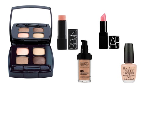 When dolling up princess style please, don’t over use pink. Think natural and glowing. I would use a liquid foundation, something like MAKE UP FOR EVER HD, invisible cover foundation. MAKE UP FOR EVER has been used for years by professional makeup artists. This stuff is amazing! It’s oil free and gives a med-to-full coverage that looks super natural and comes in 25 shades, from the fairest white to the darkest ebony this stuff has got you covered. For the eyes, I would use a nice palette of browns and pinks. I am and always will be in love with CHANEL’S spice eye quad. These are the most flattering shades and they are beautifully pigmented. And as always TOOOONS of your favorite lengthening mascara in true black. For your cheeks I would use a cream blush, like NARS’ The Multiple in orgasm, the best color ever!!! This stuff will give you that perfect flush of color and a bit of highlight. This stick can also be repurposed after the wedding to be used for eyes, cheeks, and lips. For your lips, I would try and find a berry shade close to, perhaps a shade darker, than your actual lip color, that’s a good way to describe it at the makeup counter. They will know what you are looking for, if they don’t try another brand. I have very pink lips and NARS lipstick, in gypsy works well. For your nails, I love OPI’s Isn’t it Romantic or Italian Love Affair. I am also a fan of the Essie classic, Ballet Slipper. Just make sure your nails are cut short or you run the risk of looking like a real housewife of new jersey, those ladies are crazy!!!!
So, this stuff is pretty easy. Look pretty, look sparkly, look expensive, do not look like you stepped out of an 80’s debutante ball. Doooo not go overboard. Pick your must have princess piece and that’s it.
Until we meet again, stay bridal and remember, this post is not an excuse for you to bust out a tiara, which is never acceptable...ever. Please, for the sake of fashion.
Lauren

 Finding the perfect gown isn’t just about find a dress with some black embellishments, it’s about finding a gown full of romance and mystery. Doesn’t that sound fun???? Of course it sounds fun!!!! I love romance and drama combined in a wedding dress, it becomes the kind of gown that literally takes your breath away. I’m affected by everything, so maybe it’s just me. There isn’t one specific thing I can say to help identify these gowns other than that no matter the shape they always seem light and delicate. They can be full or slim skirts, full sleeve or strapless... that’s not very good guidance, huh? I guess, regardless of the modern aspects of the gown, some part of the gown needs to make you feel like you are looking back in time. We don’t want you to look like a bar wench complete with corset and turkey leg, so don’t go overboard.
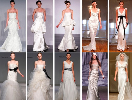 I’ve found that some designers have a flare for this style and those include the incomparable Vera Wang, but also Elizabeth Fillmore, and Melissa Sweet. I also like to check up on Reem Acra, Marchesa, Marc Jacobs, and Temperly London. These are all designers who know how to make women look beautiful and strive for innovative yet romantic looks.
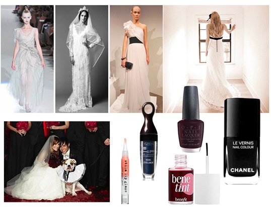 As far as wedding day beauty, keep things relatively simple. I would keep skin fresh and matte, no bronzers. To avoid looking washed out you can use a pretty peachy pink blush, like NARS orgasm, best color ever. I would use a product like Revlon’s HIP high intensity pigment kohl eyeliner, I would choose between the black, navy, or burgundy...all depending on your eye color or preference. Navy enhances all eye colors so keep that in mind. And false lashes on the corner of your eyes are a must, plus a healthy the dose of volumizing mascara. You don’t need any eyeshadow, but if you really want to wear it, go for highlight shadow along the arch and in the inner corner. The lips should be practically naked, either a nude gloss or a berry stain with a bit of clear gloss over it. For a bit more funk, wear dark nails, nails should be cut very short. I love Chanel’s black satin and OPI’s Lincoln Park after Dark or Lincoln Park after Midnight.
 Leslie Weed and Scott Baker


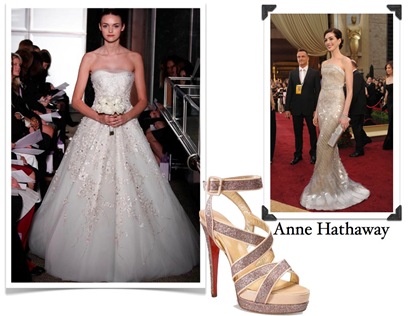 Anne Hathaway is known for her sweet, innocent persona with a hint a crazy sex appeal. Her style isn’t far from that, she dresses with a whole lot of sophistication and a touch of whimsy and spunk. Annie is a musical theatre geek at heart, so I totally see her going all out wearing a full skirt adorned with tons of sparkle. Glitter and glitz everywhere, I see her keeping jewelry to a minimum and her hair pulled into her favorite tight chignon.
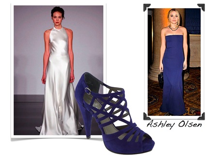 Ashley Olsen is the coolest chick ever. Seriously, Michelle Tanner is awesome! She has a way of dressing sophisticated yet completely bonkers and chic at the same time. It’s magical. She understands how to dress her petite frame without forgoing volume. She would wear something sleek with the ability to make her petite frame look 6 feet tall. I see her in this dress with towering midnight stilettos. I envision her with a lose updo and arms stacked high with diamond and sapphire cuffs and bracelets.
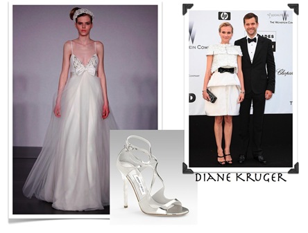 Diane Kruger is one of my favorite fashionistas. Since jumping on the scene after Troy, this German hottie always dresses sexy and out of the box. I love how she plays with masculine and feminine silhouettes, she rocks a bow tie better than anyone I know. I envision Diane as a modern princess. I love the bow detail which totally fits her fashion profile. Her shoes would be simple and crazy sexy. Accessorizing is the key, I see her with minimal jewelry, perhaps a huge cocktail ring, or maybe an intricate messy hairdo adorned with lots of sparkle. (not like the model, yikes)
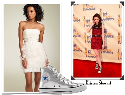 Kristen Stewart is such a little rock star, she always dresses fashionable with a ton of edge. The edge probably comes from that “I don’t give a crap” face she has glued on at all times. I love this girl! She wears just as much floaty chiffon as she does spikes and patterns, if that’s not diversity, I don’t know what is! I don’t really see k.stewart getting married, but I have a feeling that she would be ironic and quirky. I love the super short length and so does she, but forget sky high heels, how about some rocking silver Converse. The feathers, the sparkles, the shoes, plus her attitude equals super cool chick.
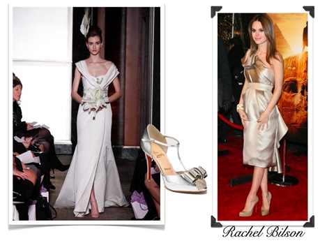 Rachel Bilson is beloved by all! Do you know someone who doesn’t think she is the best dressed lady in Hollywood? I dare you to find one...then I will punch them in the face...that was harsh. I digress, she has the most perfect style and she accessorizes like a pro. The silhouettes are always clean and simple, it’s all in the way she chooses to doll it up. I see her in a bit of a retro throw back, nothing about her gown will be “ordinary.” I love the wonderful asymmetrical sleeves and the peekaboo sparkle on the bodice. The dress accentuates the midsection, and the slit gives the gown it’s bit of sex appeal. Add a pair of sassy fun, t-strap, peep toes and she is ready to marry Darth Vader.
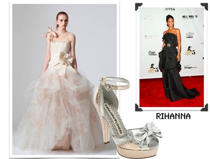 Rihanna is well, she is all kinds of things not appropriate for me to say on this blog, so I will sum it up with awesome. She is fearless when it comes to fashion, nothing scares her and sure she ends up looking wacky every once and a while, but it’s worth it for the times she looks stunning. Can’t you see it? Her hair swept up in one of her funky chic do’s and this giant peach pink gown against her stunning skin. I see bangles stacked up to her elbows and a pair of wicked high heels. Fabulous.
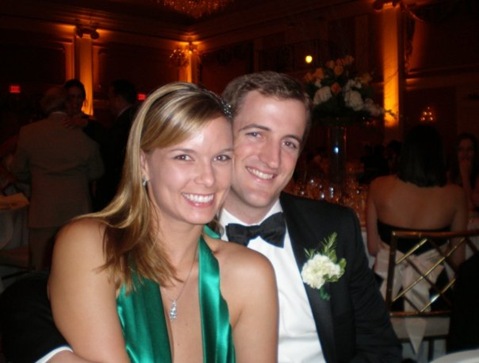 Laura Leone and Bo Hunt
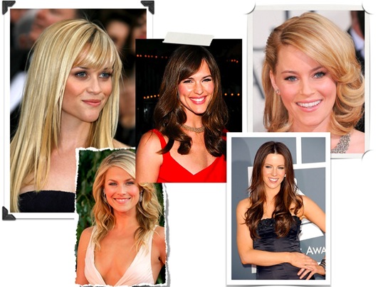 I have two major no-no’s for wedding hair, first, please don’t look through prom magazines for your hairstyle, don’t do tight barrel curls, don’t super curl two tendrils on either side of your face, no twisting of hair that is held with little clips, just avoid all things juvenile. Google image celebrity hairstyles, better yet, google this exact phrase “red carpet updos.” Only look at the celebrities or fashion photography and don’t even think about clicking a prom hair site. A few major celebs that are good to follow, Jennifer Garner, Jessica Abla/Biel, and Reese Witherspoon are among some of my favorite heads of hair. Secondly, please don’t super shellac your hair. Too tight hairstyles look unnatural and uncomfortable, seriously, it’s like asking for a headache. I hate hair without movement...it looks so...alien! It’s not impossible to have a sleek do that looks polished and sexy without looking like a prude librarian or a face-lifted alien. Penelope Cruz and Kate Beckinsale both rock the tight bun often, check out more of their styles.
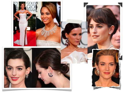
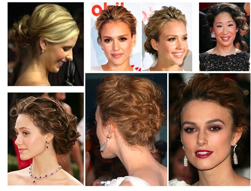 My favorite updo’s are the messy ones. I just think they are sexy and fun, plus, they can work with every type of hair. These looks are just as timeless as a pulled back bun, but because they are supposed to be messy everyone is a little bit different...unique to you. I love that! Every single women in Hollywood has rocked this look, so there are tons to choose from.
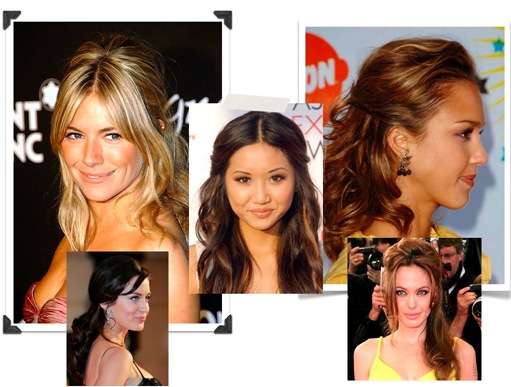 I personally could never keep my hair down for an entire event. I just touch it too much and end up looking super greasy. Greasy = Hot Mess, but for those of you who can keep your mitts off, it’s really easy, determine the best state for your hair, straight, wavy, or curly and do that. You can add a little oomph by pulling an Angelina and wearing your hair half-up. She does it all the time and she is generally regarded as the sexiest woman in the world, maybe everyone should start wearing that style.
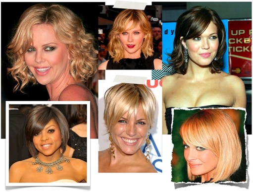 I want to cut all of my hair off sooooo bad, but that’s the one problem with having an amazing hairstylist in the family, they have final say on everything. So, since I can’t have amazing short hair I just wanted to let the ladies with short hair know that there are plenty of ways to style and wear short hair for an event! With short hair, you are always putting an emphasis on your face, which is the whole idea of a wedding hairstyle. You want your guests to see your beautiful face.
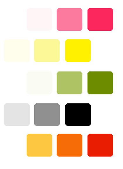


 Orange is a combination of Red and Yellow. As bright and warm and inviting color, orange relates to social communication, stimulating two way conversations. The color psychology of orange is optimistic and uplifting, rejuvenating our spirit. With its enthusiasm for life, the color orange relates to adventure and risk-taking, inspiring physical confidence, competition and independence. Those inspired by orange are always on the go! In relation to the meaning of colors, orange is extroverted and uninhibited, often encouraging exhibitionism or, at the very least, showing-off!
 Yellow is the brightest color to the human eye. It represents youth, fun, happiness, sunshine and other light playful feelings. It is a cheerful energetic color. Yellow will evokes feelings of happiness. The color psychology of yellow is uplifting and illuminating, offering hope, happiness, cheerfulness and fun.
 Green is the color of balance and harmony. It represents growth, nature, fertility and renewal. Green is a relaxing color that is easy on the eye and has a healing power to it. From a color psychology perspective, it is the great balancer of the heart and the emotions, creating equilibrium between the head and the heart and relates to stability and endurance.
 Blue is a cool calming color that shows creativity and intelligence. It is a color of loyalty, strength, wisdom and trust. Blue has a calming effect on the psyche and seeks peace and tranquility. From a color psychology perspective, blue is reliable and responsible. This color exhibits an inner security and confidence. Blue's wisdom comes from its higher level of intelligence, a spiritual perspective.
 Purple combines the stability of blue and the energy of red. Throughout history purple has been associated with royalty, nobility and prestige. It creates an impression of luxury, wealth, extravagance and power.In the meaning of colors, purple represent the future, the imagination and dreams, while spiritually calming the emotions. Purple or violet assists those who seek the meaning of life and spiritual fulfillment - it expands our awareness, connecting us to a higher consciousness.
 Black is often a color used to portray something very powerful, class, elegance and wealth. Black combined with other colors can have a very strong statement. Black is a color that can fit into almost every design to add contrast, type, and make the other colors stand out more. Alone, black wouldn’t be as dramatic but paired with any other color in the correct fashion, it is bold, timeless and beautiful.
 White is often associated with being pure, clean, fresh and good. almost heavenly and is known for symbolizing reverence, purity, truth, peace, innocence, cleanliness, simplicity, security, humility, sterility, winter, life, marriage, and hope.